UESPWiki:Featured Images/Past Nominations/Archive 7
| This is an archive of past UESPWiki:Featured Images/Past Nominations discussions. Do not edit the contents of this page, except for maintenance such as updating links. |
This is an archive of past nominations for Feature Images from September 2015 to August 2018.
Contents
- 1 File:BS-level4-Point I.jpg
- 2 File:RG-quest-Investigate the Ruins 05.jpg
- 3 File:ON-interior-Fang Lair.jpg
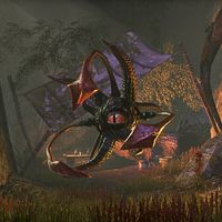
- 4 File:ON-creature-The_Whisperer.jpg
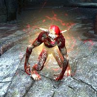
- 5 File:ON-creature-Cunning Scamp.jpg
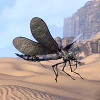
- 6 File:ON-pet-Regal Dovah-Fly.jpg
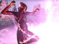
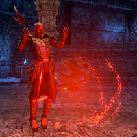
- 7 File:ON-npc-Acolyte of Bedlam 02.jpg
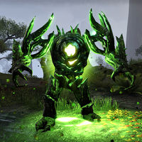
- 8 File:ON-creature-Heart of Rootwater.jpg
- 9 File:LG-cardart-Almalexia.png
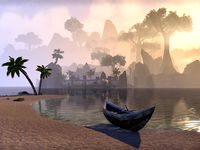
- 10 File:ON-place-Kushtashpi.jpg
- 11 File:RG-place-Realm of Clavicus Vile.jpg
- 12 File:SR-interior-Yngol Barrow 03.jpg
- 13 File:SR-creature-Vuljotnaak_02.jpg
- 14 File:ON-quest-The Missing Prophecy 02.jpg
- 15 File:RG-creature-Vermai.jpg
- 16 File:MW-quest-Old Blue Fin.jpg
- 17 File:ON-creature-Kurzoth.jpg
- 18 File:SR-interior-Temple_of_the_Divines.jpg
- 19 File:ON-creature-Xal-Nur the Slaver.jpg
- 20 File:ON-place-Brothers of Strife.jpg
- 21 File:ON-place-Castle of the Worm 05.jpg
- 22 File:ON-place-Old Ida's Cottage.jpg
- 23 File:SR-npc-Brelyna Maryon 03.jpg
- 24 File:SR-npc-Ancano 08.jpg
- 25 File:ON-quest-A Ghost from the Past 04.jpg
- 26 File:ON-npc-Aranias.jpg
- 27 File:ON-place-Shrine of Sithis.jpg
- 28 File:SR-interior-Deepwood Redoubt 02.jpg
- 29 File:ON-creature-Lord Brol.jpg
- 30 File:ON-quest-The One That Got Away 02.jpg
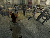
- 31 File:OB-quest-Drunk and Disorderly.jpg
- 32 File:ON-npc-Exarch Arnoth.jpg
- 33 File:OB-place-Kvatch 02.jpg
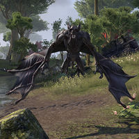
- 34 File:ON-creature-Giant Bat.jpg
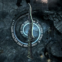
- 35 File:SR-item-Blade_of_Sacrifice.jpg
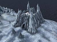
- 36 File:BM-place-Castle_Karstaag.jpg
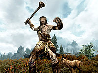
- 37 File:SR-quest-A Night To Remember 04.jpg
- 38 File:AR-npc-BlacksmithA.gif
- 39 File:ON-creature-Guar.jpg
- 40 File:OB-quest-Paranoia_07.jpg
- 41 File:ON-creature-Nereid.jpg
File:BS-level4-Point I.jpg
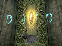
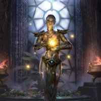
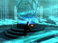
There has never been a featured image from Battlespire, and with Redguard at 3 (soon to be 4), I think it deserves some time on the front page. This one was suggested by Echo. The image shows the Hand of Kindness in Shade Perilous, with four Daedric runes floating above.
- Support: As nominator. —Dillonn241 (talk) 01:04, 25 August 2018 (UTC)
- Support: This is a really cool image to begin with, with the runes, and it's great quality for an older game. --FioFioFio (talk) 01:07, 25 August 2018 (UTC)
- Support: I guess I should support my own image. One of the (literal) bright spots in an otherwise dark and foreboding setting. In case you're wondering, the Daedric letters spell "DUSK". Echo (talk) 03:51, 25 August 2018 (UTC)
- Support: This image certainly caught my eye when I first saw it as a thumbnail. —Legoless (talk) 11:19, 25 August 2018 (UTC)
- Support: This is a really cool image and makes for a great thumbnail. The fact that it's a BS image makes this an easy support. Forfeit (talk) 15:49, 2 September 2018 (UTC)
File:RG-quest-Investigate the Ruins 05.jpg
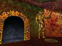
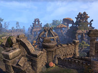
A terrific image of the interior of the Dwarven Ruins in Redguard. This was the first time Dwarven architecture was featured in a TES game, and you can quite clearly see the inspiration TES3 took from these early designs. As always, these high quality Redguard images are only possible due to Dillonn241's mastery of the game's console commands; usually, an image of this location would be obscured by UI elements and the third person player character.
- Support: As nominator.—Legoless (talk) 18:59, 21 August 2018 (UTC)
- Support: The location has an interesting peculiar look and I like the colours —SMcM (talk) 20:29, 21 August 2018 (UTC)
- Support: No reason to oppose my own image. Thanks Legoless! —Dillonn241 (talk) 20:44, 21 August 2018 (UTC)
- Support: Love to see more Redguard images. --FioFioFio (talk) 22:53, 21 August 2018 (UTC)
- Support: Great shot of a classic Elder Scrolls title. Fullerton ﴾talk﴿ 23:28, 21 August 2018 (UTC)
- Support: What the above people said! It'd be great to have more featured images from older TES games. Tib (talk) 09:35, 22 August 2018 (UTC)
- Support: Interesting image, especially considering the age of the game. --Xyzzy Talk 13:38, 22 August 2018 (UTC)
- Support: I concur with Xyzzy, was about to write the same ~ Dwarfmp (talk) 00:43, 23 August 2018 (UTC)
- Support: A really cool, colorful image from the early days. Echo (talk) 03:51, 25 August 2018 (UTC)
- Support: Great! Forfeit (talk) 15:49, 2 September 2018 (UTC)
File:ON-interior-Fang Lair.jpg
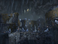
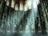
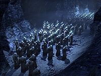
I really like how this picture emphasizes the vastness of the cavern that Fang Lair is located in and the details of the Dwemer architecture. The bright mushrooms growing among the ruins and the stalactites at the top add finishing touches which results in a really interesting image.
- Support: As nominator. --Vordur Steel-Hammer (TINV1K) 10:07, 11 August 2018 (UTC)
- Support: Great image of ESO's take on an iconic location. —Legoless (talk) 18:59, 21 August 2018 (UTC)
- Support: Nice angle, great amount of detail. It's a little bit dark but it's still awe-inspiring. --FioFioFio (talk) 22:55, 21 August 2018 (UTC)
- Support: Excellent shot of a well-constructed landscape almost reminiscent of Skyrim's Blackreach. Fullerton ﴾talk﴿ 23:28, 21 August 2018 (UTC)
- Support: Looks good to me ~ Dwarfmp (talk) 00:43, 23 August 2018 (UTC)
- Oppose: This is probably the best image that can be taken of a place like this. Unfortunately, as a thumbnail, it's hard to tell what the image is beyond a dull gray and black cave. Since that's what most people are going to see on the main page, I'm going to oppose. —Dillonn241 (talk) 11:19, 27 August 2018 (UTC)
File:ON-creature-The_Whisperer.jpg
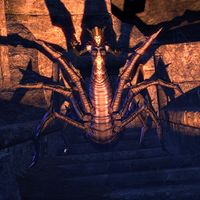
Really like the lighting on this picture, especially the shadows
- Support: as nominator. --SMcM (talk) 10:55, 29 March 2018 (UTC)
- Support: Very cool. The lighting and shadows definitely make it look more intimidating. -damon talk ♥ contribs 13:28, 29 March 2018 (UTC)
- Oppose: The image is a little too dark and the creature too similar in color to the background I think for a featured image. It's fine on its own of course, but there are other images here that stand out better. —Dillonn241 (talk) 00:56, 25 June 2018 (UTC)
- Support: While the colours are a bit bland, the shadows look amazing. I think that even with the small thumbnail it is good enough to see the details. --Ilaro (talk) 13:57, 28 June 2018 (UTC)
- Neutral: It's a nice shot but the lower third detracts from it quite a bit. There's a white spot near her leg and the lack of lighting on the stairs isn't great. Perhaps if the shot was retaken to focus higher up, showing more of her shadow on the wall and less of the stairs, it would greatly improve the image. The Rim of the Sky (talk) 21:07, 29 June 2018 (UTC)
- Support: Spooky. Exactly how you want an image like this be. Tib (talk) 20:39, 20 July 2018 (UTC)
- Support: A nice shot that looks like it would be from a Tamrielian horror story. --SIX10 (talk) 19:09, 21 August 2018 (UTC)
- Oppose: Since the stated intention of NPC and creature images is to show them in their surroundings and this image does not necessarily do so, I cannot in good faith support this image. Fullerton ﴾talk﴿ 23:28, 21 August 2018 (UTC)
- Comment: Actually the stated intention of creature images is to "show the creature as clearly as possible", which this image does. —Legoless (talk) 18:48, 22 August 2018 (UTC)
- Oppose: This is overall a very good creature image. However, it blends in just a bit too much with the background for me to support this. Forfeit (talk) 15:49, 2 September 2018 (UTC)
File:ON-creature-Cunning Scamp.jpg
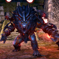
This is a very rare small creature that occasionally spawns in the depths of Imperial City (it is an open PvP zone, for those of you who do not play ESO). The image is sharp and I like the red glow surrounding the scamp. It looks evil! :D Lastly, I also think the thumbnail looks great, so this is definitely an image worthy of FI status in my eyes.
- Support: As nominator. Tib (talk) 09:54, 19 February 2018 (UTC)
- Support: Never even seen one of these guys, and they're designed to run away from the player. Not sure how an image this good was captured! —Legoless (talk) 21:39, 19 February 2018 (UTC)
- Oppose: The visual effects appear to be discoordinated and jittery, obscuring the appearance of the image's subject. Fullerton ﴾talk﴿ 21:09, 23 March 2018 (UTC)
- Support: I like how the red effect combined with the reddish creature looks. It makes the image stand out. —Dillonn241 (talk) 21:57, 23 March 2018 (UTC)
- Support: Since I don't play ESO and have no knowledge on the subject, nor the screenshot capacities, it is hard for me judge these. But seeing as there's so few votes, causing these nominations to remain open for many months, I won't shy from supporting images I think look good ~ Dwarfmp (talk) 00:43, 23 August 2018 (UTC)
File:ON-pet-Regal Dovah-Fly.jpg
A beautiful HD shot of a rather small creature in ESO. It's actually a Crown Crate-exclusive pet collectible, so it's difficult enough to get an image of without actually owning it. Certainly illustrates the step up in model quality compared to the first appearance of these creatures!
- Support: As nominator. —Legoless (talk) 22:00, 22 January 2018 (UTC)
- Support: Good quality and it would be neat to have an insect as a featured image! I'm expecting some opposition because the fly blends into the background somewhat, but I don't think it's a big issue. —Dillonn241 (talk) 09:04, 29 January 2018 (UTC)
- Support: I like it as well. It's REALLY cool. Timeoin (talk) 18:03, 29 January 2018 (UTC)
- Oppose: While I'd really like to have an insect as featured image, I don't think I can support this one. Its head, especially its eye, is hard to distinguish from the rock formation in the background. In my opinion, the features of the creature and background need to be more distinct. --Ilaro (talk) 21:13, 29 January 2018 (UTC)
- Oppose: There's really not much interesting in the photo. I suppose the detail on the wings is cool, but aside from that this image doesn't stand out from most others. The Rim of the Sky (talk) 21:47, 26 February 2018 (UTC)
- Oppose: While the wings are truly awesome in this image, the rest of the image seems blurry and unfocused. Fullerton ﴾talk﴿ 21:09, 23 March 2018 (UTC)
- Oppose: Solid image, but per the existing opposition, I don't think this is FI material. Forfeit (talk) 15:49, 2 September 2018 (UTC)
File:ON-npc-Acolyte of Bedlam 02.jpg
This image by Holomay is a really cool one featuring an Acolyte of Bedlam activating an Abyssal Geyser in Summerset, the latest dlc (chapter :P) zone in ESO. I just think the caption is great and well-timed, not much more to say. It would be nice to have a FI showing off some of the Summerset, with that said there are very many great opportunities for FIs there!
- Support: as nominator. Tib (talk) 21:09, 24 June 2018 (UTC)
- Support: Excellent detail. —Legoless (talk) 21:12, 24 June 2018 (UTC)
- Support: That's a great action shot. --FioFioFio (talk) 23:30, 24 June 2018 (UTC)
- Support: I really like it! Featured images that highlight new content are always welcome. —Dillonn241 (talk) 00:56, 25 June 2018 (UTC)
- Support: It's a very nice shot. I would have liked to see more of the Abyssal Pearl in the image but regardless it's still very good. The Rim of the Sky (talk) 21:07, 29 June 2018 (UTC)
File:ON-creature-Heart of Rootwater.jpg
Somehow this monster image has caught my attention, and I think nominating it might finally give me some peace... It has nice colors, a cool green glow, and the thumbnail is awesome. And when I looked beyond that I realized that it is actually a very proper ESO boss image, with good focus. Usually it's quite dark inside caves and it's not always possible to capture images so that they look like this; often they turn out a dark, unclear mess instead :p Luckily, (sometimes) you do not need a big size image and hours of work to capture an impressive portrait.
- Support: As nominator. Tib (talk) 18:23, 25 March 2017 (UTC)
Oppose: 600 × 612 pixels! -- SarthesArai Talk 20:40, 10 May 2017 (UTC)
-
- Comment: How about now? Echo (talk) 21:19, 10 May 2017 (UTC)
- Support: Now, I like it ;-) -- SarthesArai Talk 16:18, 21 June 2017 (UTC)
- Oppose: While a well-captured screenshot, I simply do not see anything that makes this image worthy of FI material. The pose and background are fine, but neither one is particularly remarkable. It is simply just another good creature image on the site. Forfeit (talk) 22:37, 10 May 2017 (UTC)
- Oppose: What Forfeit said. It's also rather blurry in full size. Weroj (talk) 13:22, 19 May 2017 (UTC)
- Support: The color palette for this image is very heavily vibrant and green, two things which have been somewhat lacking in a Featured Image for a while now. Also, it's now square. Echo (talk) 19:01, 19 May 2017 (UTC)
Oppose: Too small, unfortunately. Minimum is about 800px to be considered good enough to keep~ Dwarfmp (talk) 09:43, 21 June 2017 (UTC)- Support: I agree with Echo that recent featured images have been lacking in vibrant colors and green hues. Considering the lower standards for ESO, in particular images of hostile creatures, this is a fine example. —Dillonn241 (talk) 06:19, 17 October 2017 (UTC)
- Support: As to get this clear an image, they would have had to use magical trickery. Timeoin (talk) 06:23, 17 October 2017 (UTC)
- Support: The image catches the eye, and it is a very effective depiction of a Lurcher. —Fullerton ﴾talk﴿ 23:35, 17 October 2017 (UTC)
- Comment: I think it is worth noting that two of the opposing comments here are from before it was improved to a better-quality image. Timeoin (talk) 23:50, 17 October 2017 (UTC)
- Comment: Improved how? It was only re-uploaded once, and the only difference was that it was cropped from an uneven 600x612 to a square 600x600; the files are practically identical. The Rim of the Sky (talk) 04:28, 18 October 2017 (UTC)
- Oppose: This image is decent but definitely not featured image-quality. The creature itself is off-centre, and as others have said, it's fairly blurry. The only thing it has going for it is the nice illumination coming from its glowing green torso. You could take a picture of any Lurcher directly facing the camera and it would be better. The Rim of the Sky (talk) 04:28, 18 October 2017 (UTC)
- Comment: Perhaps someone can replace this image with a similar but higher quality one. I would like to see some vivid greens in a featured image. I'll keep my support on here for that reason and because it's likely this nomination will end in no consensus. —Dillonn241 (talk) 04:58, 18 October 2017 (UTC)
- Comment: I've uploaded a new 1080x1080 version in case anyone wants to reconsider their vote. --Holomay (talk) 23:46, 12 February 2018 (UTC)
- Support: The new one looks great and I'd think it would be nice to have some more green in a featured image for once. I hope people that opposed the first image could reevaluate it to see if they will support the new one. --Ilaro (talk) 14:39, 23 March 2018 (UTC)
- Comment: It's been three months since the last vote, and even though Holomay replaced the image with a higher quality version, it seems that no one else will vote on the newer image. I think it's about time to close this nomination, and perhaps re-open it so that people can vote exclusively on Holomay's improved image instead. The Rim of the Sky (talk) 21:07, 29 June 2018 (UTC)
File:LG-cardart-Almalexia.png
First, this image is the best existing representation of Almalexia, who was always suffering from somewhat lazy visual implementation. Second, as far as I know, there were no featured images from Legends yet. Third, it is also a part of incoming "Houses of Morrowind" expansion, and Morrowind can't have too much love. Fourth, last time a member of the Tribunal was nominated as the FI was in 2011.
- Support: As nominator. I'm astonished by this art and I truly believe that it is beautiful enough to become a FI. Phoenix Neko (talk) 14:20, 23 March 2018 (UTC)
- Oppose: The image is certainly stunning and one of the best Legends art I've have seen to date, I am still afraid I need to oppose this. While it isn't really stated anywhere, I think featured images are mostly intended for pictures made by editors, so they get some acknowledgment for when they, for example, managed to get an exceptional nice screenshot. --Ilaro (talk) 14:39, 23 March 2018 (UTC)
- Comment: My understanding of the "Featured image" nomination was that it means "Featured article image" ahead of everything else. So, literally any image that is used in article/s. It doesn't say "Featured user image"/"Featured screenshot" neither the rules specify that official/promo art is forbidden to be nominated. Indeed, there is a long tradition of nominating only screenshots, but frankly, it is purely arbitrary and/or coincidence rather than intended desicion. Phoenix Neko (talk) 15:27, 23 March 2018 (UTC)
- Oppose: Per Ilaro. While it isn't explicitly stated that we can't use promotional or developer-created imagery in a Featured Image nomination, I do agree with Ilaro that it cheapens what the point of Featured Images and articles is about. The entire point behind both, as with Wikipedia and other wikis, is to showcase the community's talent and work when we featured high-quality content. I feel like featuring content released by one of the game studios current, past, or in the future creates a precedent that what the community can create can be ousted in favor of a comparative developer image.
- That's why I feel despite the vague wording, the spirit of the wording was that it's about what we as a community can create and share, rather than what Bethesda Game Studios, ZeniMax Online, etc are able to create to share. It's unfortunate for the Legends namespace that virtually all imagery that can be found falls under that category, but that's the nature of the game and with my thoughts as I said I'll vote to oppose any developer-created imagery in a Featured Image vote. -damon talk ♥ contribs 17:21, 23 March 2018 (UTC)
- Oppose: The spirit of the rule has always been applied, and that is that the image must be taken by and for use on a UESP article. This forbade modded images and artwork, and worked without controversy before Legends. Silence is GoldenBreak the Silence 18:50, 23 March 2018 (UTC)
- Oppose: While a stunning and artful illustration of Almalexia, I do believe that featured images should be showing off our editor's ability to take creative and high quality screenshots. JarlUlfric (talk) 19:35, 23 March 2018 (UTC)
- Oppose: Not to dogpile, but I do want to say that we should never wholesale rip an asset out of a game and use it as a featured asset. I believe this isn't in good faith, and so should be steered clear of. Fullerton ﴾talk﴿ 21:09, 23 March 2018 (UTC)
- Oppose: It's a great image, but as others have said, featured images should be user-created work. —Dillonn241 (talk) 21:57, 23 March 2018 (UTC)
- Neutral: Not bad but not good. The Rim of the Sky (talk) 05:10, 27 March 2018 (UTC)
File:ON-place-Kushtashpi.jpg
I'd like to submit this landscape image of Kushtashpi, a Daedric Ruin in Vvardenfell. It took me a decent amount of time to be able to get to where I ended up taking this screenshot, and I think it turned out beautifully. The bright blue sky contrasts with the dark stone of the ruin, which I think is visually stunning. That and it really shows the vastness of Morrowind and how sprawling some of these daedric ruins can be.
- Support: As nominator. — Unsigned comment by JarlUlfric (talk • contribs) at 03:06 on 20 October 2017 (UTC)
- Support: This is a spectacular landscape image. --FioFioFio (talk) 03:23, 20 October 2017 (UTC)
- Support: I second this (as I said on Discord, I thought it should be listed as a Featured Image :D) Timeoin (talk) 03:28, 20 October 2017 (UTC)
- Support: A nice shot, as much of an overview of the daedric ruind as you might get. -- SarthesArai Talk 15:03, 11 November 2017 (UTC)
- Support: Pretty neat view of the ruin. Shows all the walls, shrines, and overgrowing plantlife in just one frame. The Rim of the Sky (talk) 21:47, 26 February 2018 (UTC)
File:RG-place-Realm of Clavicus Vile.jpg
Another stunning image by our resident Redguard photographer Dillon. It needs to be noted that this game is third person, so it takes serious trickery and technical know-how to capture images like this. This image in particular is not only a great portrayal of a rarely-seen game location, it is also very significant from a lore perspective. Showing off the realm of Clavicus Vile in all its glory makes this a highly valuable image for the wiki, and it is particularly topical given the role Vile is playing in the ongoing ESO storyline at present. It would make for a relevant (and gorgeous) FI.
- Support: As nominator. —Legoless (talk) 14:18, 11 November 2017 (UTC)
- Support: I'm amazed at how this looks, given the game's general graphics. -- SarthesArai Talk 15:03, 11 November 2017 (UTC)
- Support: The work required to get this is incredible, and it’s a good snapshot of TES history.--FioFioFio (talk) 16:19, 11 November 2017 (UTC)
- Support: Great quality for the given namespace. An easy support. Forfeit (talk) 18:31, 11 November 2017 (UTC)
- Support: As photographer. Thank you everyone for the kind words! —Dillonn241 (talk) 19:47, 11 November 2017 (UTC)
- Support: Beautiful Redguard screenshot (thanks Dillon) that captures an important place in the storyline of Redguard. —Hohni 21:27, 27 November 2017 (UTC)
File:SR-interior-Yngol Barrow 03.jpg
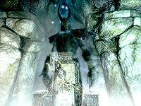
A very haunting photograph, taken at an aesthetically pleasing angle. The mists surrounding it also give it a certain aura, and the contrast between the shade and the skeleton add to it.
- Support: As nominator. The Rim of the Sky (talk) 05:56, 17 October 2017 (UTC)
- Support: This is a great image. I really like how the ghost and skeleton overlap, showing the helmet on both. I anticipate that the contrast will be an issue for some, but overall the image captures this scene very well. —Dillonn241 (talk) 06:09, 17 October 2017 (UTC)
- Support: Very good depiction of this interesting dungeon boss. —Legoless (talk) 23:29, 17 October 2017 (UTC)
- Support: The image has a good sense of mystery about it and it is a very good candidate for featured image. —Fullerton ﴾talk﴿ 23:35, 17 October 2017 (UTC)
- Support: I'm not a huge fan of the lighting, but the ghost/skeleton overlap is just incredible. --FioFioFio (talk) 03:41, 20 October 2017 (UTC)
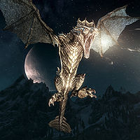
File:SR-creature-Vuljotnaak_02.jpg
I came across this neat image today: a nice action shot with a good angle and cool light effects: the glow on the dragon and its Thu'um make a nice contrast to the night sky, and the moon in the background tops it all off. It also would be a good time to feature a Skyrim shot, what with the Heroes of Skyrim expansion for Legends coming out soon and Switchrim and Skyrim VR being featured at E3.
- Support: As nominator. ~ Alarra (talk • contribs) 01:40, 21 June 2017 (UTC)
- Support: Need to remind them that dragons don't have 6 limbs. —Legoless (talk) 02:43, 21 June 2017 (UTC)
- Support: I like it. Looks very intimidating. Forfeit (talk) 04:06, 21 June 2017 (UTC)
- Support: Let's do this -- SarthesArai Talk 16:18, 21 June 2017 (UTC)
- Support: Impressive dragon, and its a good shot of the dragon breathing dragon-stuff (Magicka/Fire/Whatever the hell that stuff is) -DingoBongo777 (talk) 13:29, 10 September 2017 (UTC)
- Support: Even though it's a shot taken at night, the dragon fire manages to illuminate itself well enough. The image does miss out part of the dragon's wing, but this is just a minor nitpick. Overall, a well timed image taken at a high quality, showing the majesty of the dragons in Skyrim. You have my support. KriHavok (talk) 13:39, 10 September 2017 (UTC)
- Support: It's an awesome, very clear, action shot. --FioFioFio (talk) 00:53, 11 September 2017 (UTC)
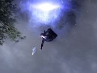
File:ON-quest-The Missing Prophecy 02.jpg
I think this is a great shot, especially at full size. You clearly see Rhea screaming in fear and reaching for anything to hold, even if it's just the book she was carrying.
- Support: As nominator. -- SarthesArai Talk 20:40, 10 May 2017 (UTC)
- Support: Per nominator. This is a really cool image! Forfeit (talk) 22:37, 10 May 2017 (UTC)
- Support: Looks great, and such a unique shot! Now's the perfect time for it to be featured, considering ESO:MW early access is just less than 2 weeks away! KriHavok (talk) 03:28, 11 May 2017 (UTC)
- Comment: Please make sure to refresh your browsers to see the latest version of the image. Legoless has cropped the image so it's completely centered on Rhea. It's something I've been considering when I was preparing the screenshot for upload, but I decided to show part of the building in order to create a better sense of space and height. However, looking at the version centered on Rhea now, I think it's the better choice. Sometimes it's okay to sacrifice a few pixels to get a good framing. :) Holomay (talk) 08:12, 11 May 2017 (UTC)
- Support: The captured impression is quite unique, so I'd support this one. At first I hesitated, because you cannot really see she is in the air (she could just as well be standing on the ground and yelling), but maybe this upside down perspective is what makes the image interesting. Tib (talk) 11:12, 19 May 2017 (UTC)
- Support: This is a funny screenshot. It does a good job of capturing motion and emotion in a still image. Weroj (talk) 13:22, 19 May 2017 (UTC)
- Support: (edit conflict) Supporting so we can close this off and get it up in time for ESOMW release. It's a great image, really captures the NPC's emotion to a surprising degree. —Legoless (talk) 13:28, 19 May 2017 (UTC)
File:RG-creature-Vermai.jpg
There are only two Vermai in Redguard, found together in a lategame area. This is a crazy hard image to capture and I honestly didn't think we ever would. It also likely surpasses any other image of these things in existence, since it required use of the console to capture the creature so clearly (Redguard is usually third-person). This is also the last time we ever saw the Vermai in TES, so it's great to have the more modern depiction of the Daedra now.
- Support: As nominator. —Legoless (talk) 00:53, 22 March 2017 (UTC)
- Support: I captured the image. —Dillonn241 (talk) 01:03, 22 March 2017 (UTC)
- Support: Very interesting story to the image, makes it notably different and unique, plus it's good to see the more lesser-known and obscure TES games get more attention. I support! —KriHavok (talk) 20:09, 27 April 2017 (UTC)
Oppose: The image is too dark. As a thumbnail, it is very difficult to even see what the image is depicting. It looks like some simple color correction/brightening could probably fix this though. As it is, I can't justify supporting this image despite its significance. Forfeit (talk) 22:45, 27 April 2017 (UTC)- Support: I like the newest version much more than the previous version. While I don't feel strongly about this nomination one way or the other now, I'll side with support based on Legoless' reasoning. It's never a bad idea to showcase some of the unique content we have for some of the more obscure entries in the series and the image is perfectly fine now. Forfeit (talk) 04:05, 28 April 2017 (UTC)
- Support: This may just be the hardest creature to get an image of in the series. The sheer quality of it is also very impressive. The Rim of the Sky (talk) 22:29, 28 April 2017 (UTC)
- Oppose: Hard or not, this is not a remarkable image. With this justification, we should nominate all hard to capture images just because, and this just wouldn't work. (Again, I might not be able to appreciate images from a game as old as this one.) Tib (talk) 11:12, 19 May 2017 (UTC)
- Oppose: Per Tib... Weroj (talk) 13:22, 19 May 2017 (UTC)
File:MW-quest-Old Blue Fin.jpg
A surprisingly cinematic image of an iconic Morrowind quest. The angle is great, the lighting is fantastic, and the fish itself is clearly displayed.
- Support: As nominator. —Legoless (talk) 16:35, 13 January 2017 (UTC)
- Support: Blue-Fin, we meet again you bugger. -damon talk ♥ contribs 18:59, 13 January 2017 (UTC)
- Support: A good clear shot that makes me interested in the quest, and it would be appropriate to have at least one Morrowind image some time before the ESO expansion's release. ~ Alarra (talk) 05:29, 17 February 2017 (UTC)
- Oppose: It's a rather boring shot, with Old Blue Fin not even facing the camera... -- SarthesArai Talk 20:40, 10 May 2017 (UTC)
- Oppose: I think the problem here is that since I haven't played MW almost at all, I might not be able to appreciate this image for what it is. But I really wonder if it wouldn't be possible to get a better angle on this? Tib (talk) 11:12, 19 May 2017 (UTC)
- Oppose: Per SarthesArai Weroj (talk) 13:22, 19 May 2017 (UTC)
File:ON-creature-Kurzoth.jpg
A really valuable image, being our only decent example of a "glowing" nirncrux-infused troll. Aside from that, the model is in a spectacular pose with good lighting and great facial detail. It's hard to get ESO shots of this quality outside of official promo material.
- Support: As nominator. —Legoless (talk) 20:37, 3 December 2016 (UTC)
- Oppose: It's a good enough creature shot, but I don't think that should be enough to qualify as a featured image. There's nothing really breathtaking about this one. Weroj (talk) 10:53, 9 December 2016 (UTC)
- Support: Cool creature shot. The pose and glow both help to make the beast look even more intimidating. Forfeit (talk) 20:38, 27 December 2016 (UTC)
- Oppose: I agree with Weroj; it's a cool shot of the creature but there's nothing that particularly stands out as FI-worthy of it to me. ~ Alarra (talk) 05:29, 17 February 2017 (UTC)
- Support: I like the image more then the others and it's a nice image :p ~User:Kwint0n
File:SR-interior-Temple_of_the_Divines.jpg
The beams of light shining from the windows make this image. The composition is also good, showing the shrines at the bottom, and the windows at the top.
- Support: As nominator. Weroj (talk) 10:53, 9 December 2016 (UTC)
- Oppose: Maybe I'm biased because of the Special Edition, but the textures in this scene are a little too busy. The light and the upward angle kind of detract from the shrines themselves, which are what the image is seemingly meant to depict. —Legoless (talk) 16:38, 9 December 2016 (UTC)
- Oppose: I agree with Legoless in that the actual subject is kind of hard to see in the image. I'd prefer an angle more like the oldest version of this image. Forfeit (talk) 20:38, 27 December 2016 (UTC)
- Oppose: The God rays are a bit too bright, and I feel like it's detracting from the presentation the interior to have such a bright white space in the room instead of something a bit more subtle. I actually don't mind the look of the textures or even the framing of the image itself, but the light balance doesn't feel right to me. -damon talk ♥ contribs 22:01, 27 December 2016 (UTC)
- Oppose: I agree, the rays are too bright, to the point that they obscure the shrines in the background. ~ Alarra (talk) 05:29, 17 February 2017 (UTC)
- Support: Agree with Weroj, this is such a classic theme, and seeing it taken in a game is awesome. As you said, the light from the windows is beautifully captured and the angle is very suitable, too. These create the atmosphere which in its turn makes the image. Tib (talk) 18:28, 25 March 2017 (UTC)
File:ON-creature-Xal-Nur the Slaver.jpg
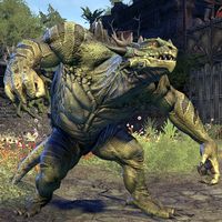
A terrifically-framed image of an Argonian Behemoth, giving a sneak peak into what Murkmire might look like on the wiki. The lighting really shows off all the assets well. I don't consider the resolution to be an issue with images of ESO enemies.
- Support: As nominator. —Legoless (talk) 17:00, 4 December 2016 (UTC)
- Support: You beat me to it! I already noticed the smaller, lower quality image back when SarthesArai first uploaded it, and this is a perfect improvement from the older image. Extremely nice caption from deep inside one of the Shadows of the Hist DLC dungeons :) Tib (talk) 17:04, 4 December 2016 (UTC)
- Oppose: It's a decent creature shot, but nothing special. It looks good as a thumbnail, but a little bit blurry in full-rez. Weroj (talk) 10:53, 9 December 2016 (UTC)
- Oppose: This is a perfectly fine creature image but it does not really seem like anything worth featuring. While a well captured shot, there simply isn't anything in the image that gives it that "wow" factor as it is just an image of the creature standing fairly still. Forfeit (talk) 20:38, 27 December 2016 (UTC)
- Oppse: It's a very good quality image, but it's also a pretty standard looking image as far as presentation is concerned, and without a little something to make it a bit more special looking, I'm not convinced it's FI good. -damon talk ♥ contribs 22:01, 27 December 2016 (UTC)
File:ON-place-Brothers of Strife.jpg
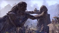
A window to the past of Stonefalls... This statue tells a story of two brothers and their ultimate sacrifice to save their home in the face of war. Brothers of Strife is an interesting bit of lore and, in my opinion, one of the things you definitely take with you when you leave the Stonefalls area in ESO. Again, this is such a great FI material. As above, if there is something you think could be improved, share your thoughts!
- Support: As nominator. Tib (talk) 23:28, 12 November 2016 (UTC)
- Oppose: While I agree that this is a rather potent image, it is difficult on first, and even second, glance to identify the brothers in the image. - KINMUNE ﴾TALK﴿ 03:26, 13 November 2016 (UTC)
- Oppose: This is a really nice image overall but there's just a little too much shadow on the left face. It would make it easier to see the brothers in the image if this issue was addressed. It looks like taking it at a different time of day might help in erasing this shadow. Forfeit (talk) 07:14, 20 November 2016 (UTC)
- Support: I like it. It's hard to get good colouring in Stonefalls, but the clear weather really shows off the scale of these statues. —Legoless (talk) 16:46, 3 December 2016 (UTC)
-
- Comment: Yeah, I spent an hour in Stonefalls checking the angles and this is probably the best one. The weather condition as well :) And you can't show the left face without moving a lot to the right, and this would make a worse overall image. (Tib the expert has spoken!) Tib (talk) 17:45, 3 December 2016 (UTC)
- Oppose: I like the landmark, but the screenshot isn't anything special. Weroj (talk) 10:53, 9 December 2016 (UTC)
- Oppose: Per KINMUNE and Forfeit -damon talk ♥ contribs 22:02, 27 December 2016 (UTC)
File:ON-place-Castle of the Worm 05.jpg
A haunting, gloomy image. How does it happen when you lose your soul and freedom for somebody's twisted entertainment? This is an epic scene depicting the Soul Shriven, who are central in the story of ESO. It's a must have for the UESP Featured Images in my eyes... I ask you to look at the potential of this image. If you feel it could somehow be improved, please write down your thoughts :) Thanks!
- Support: As nominator. Tib (talk) 23:28, 12 November 2016 (UTC)
- Support: The rows going part the image's edge seem to imply endlessness, the bowing of the heads suggests just how desolate these soul shriven are. It perfectly captures the 'endless misery' theme of Coldharbour. - KINMUNE ﴾TALK﴿ 03:26, 13 November 2016 (UTC)
- Support: Uhh, this whole image radiates despair... -- SarthesArai Talk 14:50, 13 November 2016 (UTC)
- Support: Shame we didn't have this one in time for Halloween, it's pretty spooky. —Legoless (talk) 16:46, 3 December 2016 (UTC)
- Support: This is very good. Weroj (talk) 10:53, 9 December 2016 (UTC)
File:ON-place-Old Ida's Cottage.jpg
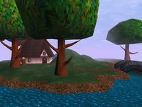
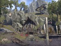
A picturesque homestead nestled in the central grasslands of Morrowind, with a bunch of dying plague victims shuffling along in front. A casual reminder that the "Good" Daedra never truly bowed to their Anticipations in Almsivi. Also just a stunning image of an otherwise obscure striking locale.
- Support: As nominator. —Legoless (talk) 04:23, 23 August 2016 (UTC)
- Support: Nice depth of field. Echo (talk) 05:03, 23 August 2016 (UTC)
- Support: Can I support my own image? I completely forgot I took this one, by the way. I was so surprised when I saw my own username on it. LOL. —likelolwhat talk lulzy to me 06:14, 23 August 2016 (UTC)
- Support: It looks very homey! Weroj (talk) 16:53, 3 September 2016 (UTC)
- Support: It is a good image. - KINMUNE ﴾TALK﴿ 02:47, 25 September 2016 (UTC)
File:SR-npc-Brelyna Maryon 03.jpg
A nice shot of one of my favorite companions, with a summoned critter. --AKB Talk Cont Mail 18:02, 30 July 2016 (UTC)
- Support: As nominator. --AKB Talk Cont Mail 18:02, 30 July 2016 (UTC)
- Support: Great angle. —Legoless (talk) 18:11, 30 July 2016 (UTC)
- Support: A cool image. - KINMUNE ﴾TALK﴿ 03:13, 4 August 2016 (UTC)
File:SR-npc-Ancano 08.jpg
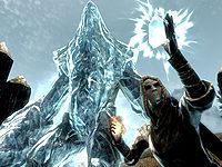
One of the best special effect shows for Skyrim.
- Support: As nominator. --AKB Talk Cont Mail 18:02, 30 July 2016 (UTC)
- Support: The effect doesn't even look this good in-game, so this is a great image. —Legoless (talk) 18:11, 30 July 2016 (UTC)
- Support: Excellent image of a really cool scene. Forfeit (talk) 18:33, 30 July 2016 (UTC)
- Support: An amazing image of an amazing scene. - KINMUNE ﴾TALK﴿ 03:13, 4 August 2016 (UTC)
- Support: It captures the power of the scene very well. --Echo (talk) 03:38, 4 August 2016 (UTC)
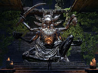
File:ON-quest-A Ghost from the Past 04.jpg
Following up on a recent nomination of a similar image, which reached no consensus, I'd like to see if we can agree on another version of the statue of Sithis. Since I received a few positive comments about this image, I've decided to put it up for the voting. The angle here is exactly how I want it to be, and the image is sharp. It's taken from the top of stairs opposite the statue, which allows you to see that Sithis is holding a little brazier in his hand. The fact that there is a small Argonian standing in front of it is possibly less optimal, although in a way, it gives you a feeling of how big the statue is.
Please write your comments and if you have further opinions regarding improving the image, leave them so that we can have a nice new FI, because we all seem to agree this is a magnificent statue.
- Support: As nominator. Tib (talk) 16:22, 17 July 2016 (UTC)
- Support: The previously nominated image was cool, but this is even better. Awesome subject captured perfectly. I particularly like how the flame is visible in this version of the image where it couldn't be clearly seen in the other. Forfeit (talk) 16:36, 17 July 2016 (UTC)
- Support: New version looks great! The Argonian in the image is fine; I agree that it gives an idea of the size of the statue. ~ Alarra (talk) 17:12, 17 July 2016 (UTC)
- Support: I like the angle, lighting and the composition of this picture. Makes the statue look really imposing. The NPC for scale is a nice touch. Contraptions (talk) 17:55, 17 July 2016 (UTC)
- Support: Angle, light, composition, it is all there. I especially like how well the size of the statue shows. —MortenOSlash (talk) 18:15, 17 July 2016 (UTC)
- Support: A great image, and the NPC invokes the same sense of wow for scale that the first ESO featured image had, which definitely adds to, rather than detracts from, the whole composition. --Enodoc (talk) 20:24, 17 July 2016 (UTC)
- Support: Excellent subject matter, and it provides a sense of being insignificant, which I quite like in an MMO. - KINMUNE (TALK) 01:22, 18 July 2016 (UTC)
- Support: The complaints for the previous image are pretty much all addressed for, so why not? The lighting's great, the thumbnail looks pretty good, and looks even better with the large image. Phacteria (talk) 05:42, 22 July 2016 (UTC)
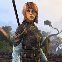
File:ON-npc-Aranias.jpg
At first sight this picture stands out as if it was a painting, mainly due to the angle of light, especially on Arianas' face. It has captured a movement and involvement from the character in a way it feels more like done by an actor than by an animation.
- Support: As nominator. —MortenOSlash (talk) 05:27, 6 July 2016 (UTC)
- Oppose: It's not a bad image on its own, but since our standards say that NPC images have to show as much of the NPC as possible, then unless there's a good reason why she's only shown from waist-up, we should probably have an image that shows more of the NPC. Right now I'm not supporting because this image doesn't appear to meet image standards.-damon talk ♥ contribs 15:24, 6 July 2016 (UTC)
- Oppose: Per Damon. It is indeed a very nice picture, but it doesn't meet our standards for the primary picture of an npc. -- SarthesArai Talk 19:26, 6 July 2016 (UTC)
- Comment: It's unfortunate that our flawed standards result in an amazing image like this one being inappropriate for feature status. I can't support the nomination because of that ridiculous composition rule, but I can't oppose it either, because as a picture of the NPC, it's a very good image. --Enodoc (talk) 20:13, 6 July 2016 (UTC)
- Comment: I agree with this. I've actually been tempted to make a discussion in the Community Portal to suggest having different standards for ESO: the character dialogue shots such as this one are easily the best, clearest way to recognize an NPC: you can see their facial features and expressions (to give an idea of their personality) easier, and lighting tends to be much better when in dialogue than outside of it. This one shows a bit less than most, but generally dialogue shots show from roughly the knees up. I think an image that shows an NPC's face clearly and in good lighting and just happens to be missing the part from their knees down is preferable to one with poorer lighting and farther away that shows the whole NPC: the feet/knees aren't the important part of the NPC. The intention with an NPC image is to have a good shot where you can easily recognize them, and I think dialogue shots in most cases are the best way to do that. ~ Alarra (talk) 23:35, 6 July 2016 (UTC)
- Comment: I don't want to derail the nomination too much with politics, but I disagree with the notion that the standards are flawed. The intent behind it is good and well-meaning, wanting the NPC's primary image to be indicative of them in their natural environment with a good look at their appearance, and I definitely feel like that should remain the primary standard, even for ESO. This image is lit up well and looks really damn good, don't get me wrong, but as Aranias' primary image, it's so close-up that it's not capturing her in her natural habitat particularly well. We have no real indication of her environment, nor do we have an accurate depiction of her whole appearance, which is what the point of the primary image for an NPC is to show. Because ESO is inherently different when it comes to framing up and capturing images of things in-game, there's always small hiccups to be expected, but that doesn't mean that the standard should be changed entirely. Where practical, I am absolutely behind the first-choice image being as full as possible to give the best appearance for an NPC that can be given, although at the same time as an MMO there should be enough flex to accommodate circumstances where it just isn't practical to get a full image, whatever the case-by-case circumstances may be. But the rule as it is is fine, I think, and the rule should always be the first thing attempted to follow when looking to frame up and take images of NPCs in the game. At least in my opinion. -damon talk ♥ contribs 18:15, 7 July 2016 (UTC)
- Comment: I agree with this. I've actually been tempted to make a discussion in the Community Portal to suggest having different standards for ESO: the character dialogue shots such as this one are easily the best, clearest way to recognize an NPC: you can see their facial features and expressions (to give an idea of their personality) easier, and lighting tends to be much better when in dialogue than outside of it. This one shows a bit less than most, but generally dialogue shots show from roughly the knees up. I think an image that shows an NPC's face clearly and in good lighting and just happens to be missing the part from their knees down is preferable to one with poorer lighting and farther away that shows the whole NPC: the feet/knees aren't the important part of the NPC. The intention with an NPC image is to have a good shot where you can easily recognize them, and I think dialogue shots in most cases are the best way to do that. ~ Alarra (talk) 23:35, 6 July 2016 (UTC)
- Oppose: The angle is interesting but it doesn't meet standards. I don't really see a need to replace it though. —Legoless (talk) 22:11, 6 July 2016 (UTC)
- Support: Great image of the character. The lighting and angle are both really nice. There should obviously be a full body image of the NPC as well to meet the standards, but that doesn't mean that this in itself isn't a good image. Forfeit (talk) 04:30, 8 July 2016 (UTC)
- Oppose: It looks a bit too cartoon-y. --Dragon Guard (talk) 11:28, 11 July 2016 (UTC)
- Support: I absolutely agree with Enodoc and Alarra (because I've had the exact same thought) and this is why I'm voting support to mark that perhaps the image standards could be revised (at least for ESO). Tib (talk) 16:22, 17 July 2016 (UTC)
- Support: Per Tib and Forfeit, and if this doesn't meet standards, what about http://en.uesp.net/wiki/File:ON-quest-Goblin_Marq_02.jpg ? That's a featured image. Due to the difficulty of image capturing with ESO, perhaps the standards need to be tweaked? Phacteria (talk) 06:23, 22 July 2016 (UTC)
- That image is a quest image, hence the prefix ON-quest in the name. It's a 4:3 aspect ratio image showing a subject that is related to the quest the image is named for. This FI vote right now is for an NPC image, 1:1 aspect ratio, with a full shot of the NPC. I want it on the record that I opposed that image because it was boring looking and the lighting and angle and posture looked bizarre, but as far as the image standards that I linked to earlier in the vote goes, it's in line with what the standards for that type of image should be. And, if you feel strongly enough to argue one way or another, there's a quite ignored Community Portal discussion to allow the community a forum outside of this nomination to discuss the standards for NPC images in ON. Here is a link to the current image standards for various types of images, if you want to give it a read and have the knowledge of why images are done the way they are, if you're interested in giving that a reading as well. -damon talk ♥ contribs 14:38, 22 July 2016 (UTC)
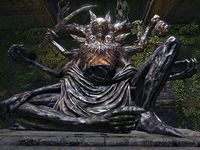
File:ON-place-Shrine of Sithis.jpg
Holy. Crap. Quite possibly the coolest depiction of a god in the games. It's like if John Carmack designed a monster based on Shiva.
- Support: As nominator. Insignificant RevisionsThreats•Evidence 21:03, 18 June 2016 (UTC)
CommentOppose: This is very good FI material, but I desire a more zoomed out version, something in the middle of this one and the loading screen image (which looks roughly like this - [1]). This angle doesn't do the statue full justice :p But yes, the statue is awesome! Tib (talk) 21:46, 18 June 2016 (UTC)
-
- I think keeping it close to the statue makes sense, because I'm just not seeing much else of interest of capture. The angle makes it imposing, and the range complements this effect. I'm concerned the only significant effect of zooming out would be to dilute the awesomeness of the statue with the rather typical renderings around it. Insignificant RevisionsThreats•Evidence 18:21, 19 June 2016 (UTC)
- It is not to capture surroundings, but to show a statue from a straight angle to avoid distorted proportions. That would also show the fire that he is holding in his hand much more clearly.
I will not oppose the nomination to not sabotage the outcome, but I will not support either, because I've been inside Xith-Izkul and I know how I want it :D(Uploaded another example here to illustrate my request.) Apologies for derailing. Tib (talk) 10:04, 22 June 2016 (UTC)- Seeing that almost everyone agrees regarding my concern, I'll change my vote to oppose. Hope we get an improved image soon though! Tib (talk) 22:32, 25 June 2016 (UTC)
- That looks very nice; I'd happily support it. Insignificant RevisionsThreats•Evidence 02:14, 26 June 2016 (UTC)
- Seeing that almost everyone agrees regarding my concern, I'll change my vote to oppose. Hope we get an improved image soon though! Tib (talk) 22:32, 25 June 2016 (UTC)
- It is not to capture surroundings, but to show a statue from a straight angle to avoid distorted proportions. That would also show the fire that he is holding in his hand much more clearly.
- I think keeping it close to the statue makes sense, because I'm just not seeing much else of interest of capture. The angle makes it imposing, and the range complements this effect. I'm concerned the only significant effect of zooming out would be to dilute the awesomeness of the statue with the rather typical renderings around it. Insignificant RevisionsThreats•Evidence 18:21, 19 June 2016 (UTC)
- Support: I like it enough, although I'm not opposed to suggested updates. --AKB Talk Cont Mail 00:22, 22 June 2016 (UTC)
- Support: As the infamous JonTron once said, "That's fucking metal as fuck, dude!". In all serious, this is an incredibly badarse image that has to be shared with the world. But, yeah, the image could have been take a wee bit further away. --Rezalon (talk) 07:34, 23 June 2016 (UTC)
- Support: If a farther-away one looks better, then sure, let's go with that, but it's already a pretty awesome image as it is. ~ Alarra (talk) 06:55, 24 June 2016 (UTC)
- Oppose: I'm opposing only because a neutral vote is useless, but while the statue looks cool, I am not a fan of the angle and the lighting. I feel like it could be set up a little better. That said, it's still an interesting image, though it isn't good enough to support outright. -damon talk ♥ contribs 22:37, 24 June 2016 (UTC)
- Oppose: I oppose because of what most supporters have mentioned: zoomed out from a more downward-looking perspective is what I, and more people want to see. I feel the angle would be better, so I'd like to see that first. I would implore voters to take a clear stand, and for those that can access the game to go for that shot (if of course that is possible) ~ Dwarfmp (talk) 15:33, 25 June 2016 (UTC)
- Oppose: I was the one who cropped it, and I wasn't happy with the result. The original was great but squishing it into a 4:3 ratio cuts off the edges of the statue. A shot taken one or two inches back would capture the whole thing. The problem is that this location is only visited once per character, often has NPCs in front of it, and is usually obscured by the smoky visuals which affect your camera for most of the quest. —Legoless (talk) 16:51, 25 June 2016 (UTC)
Gonna close this one a little earlier than usual since it seems like a different version will be proposed instead. —Legoless (talk) 03:27, 26 June 2016 (UTC)
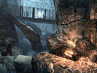
File:SR-interior-Deepwood Redoubt 02.jpg
I was really struck by the fact that this image has changes in depth, height, and color.
- Support: As nominator. --MetaCthulhu (talk) 02:11, 2 May 2016 (UTC)
- Support: Really cool picture. Looks like a pic from someone's vacations on Instagram. --Manu (talk) 13:53, 2 May 2016 (UTC)
- Oppose: Indeed, it looks like an image of someone's vacations on Instagram, including lack of good composition and no clear focus point. Tib (talk) 20:40, 2 May 2016 (UTC)
- Support: It's hard to get a good dungeon interior shot that makes a location seem unique, and I think this one really captures that. I also really like the hot/cold colour contrast in the middle of the image. --Enodoc (talk) 21:02, 2 May 2016 (UTC)
- Support: Per Enodoc. I feel the image captures the area quite well and I immediately remembered the dungeon it is from soon after looking at it. Forfeit (talk) 18:21, 3 May 2016 (UTC)
- Oppose: Per Tib. Kinetically-Interlinked Nirnian Multi-User NthGen Exoform (talk) 11:34, 9 June 2016 (UTC)
- Support: This captures a pretty memorable dungeon layout perfectly. —Legoless (talk) 21:34, 14 June 2016 (UTC)
File:ON-creature-Lord Brol.jpg
I really like the way the light shines off this creepy tentacle orb bro, the colours are vivid, and the background is interesting and pretty in its own right.
- Support: As nominator. Weroj (talk) 16:40, 5 February 2016 (UTC)
- Support: Other than the piece of material tied to the poles that's in the background which is blocking part of the plant-life of the area, I agree with all of the points of the nominator. --Rezalon (talk) 10:05, 28 February 2016 (UTC)
- Support: It looks nice. It's not very easy to get a good shot of this type of monster npc. Tib (talk) 22:55, 18 April 2016 (UTC)
- Support: Like the colours and clarity, easy to support. Biffa (talk) 11:28, 19 April 2016 (UTC)
- Support: Watchers are constantly moving and thus really hard to screenshot. That alone would influence my vote, but in addition I really like the colors in this one. All in all, very well done. —likelolwhat talk lulzy to me 20:48, 2 May 2016 (UTC)
- Support: Just in general a really cool image. --Kinetically-Interlinked Nirnian Multi-User NthGen Exoform (talk) 11:34, 9 June 2016 (UTC)
File:ON-quest-The One That Got Away 02.jpg
Just a really pretty image here. Gorgeous background and the water looks great too. From what I understand, the rowboat has importance to the related quest as well so this image definitely helps to provide a memorable representation of this moment of the quest. Overall, I think this image would look great on the main page.
- Support: As nominator. Forfeit (talk) 22:48, 13 April 2016 (UTC)
- Support: The lighting is great and the manor in the background remains clear despite the draw distance fog. —Legoless (talk) 17:44, 16 April 2016 (UTC)
- Support: I want to live there Manu (talk) 11:42, 18 April 2016 (UTC)
- Support: Hm, can't resist supporting my own image. It looks very nice as a thumbnail. *beams with pride* Tib (talk) 22:55, 18 April 2016 (UTC)
- Support: What they said. -damon talk ♥ contribs 03:25, 19 April 2016 (UTC)
- Support:V.nice image. Biffa (talk) 10:51, 19 April 2016 (UTC)
File:OB-quest-Drunk and Disorderly.jpg
This image does a great job of capturing this moment of the quest. I particularly like how the angle is from the innkeeper Witseidutsei's perspective as it allows me to imagine the annoyance and anger she must be feeling as she sees the three Fighters Guild members causing trouble and driving away all her business.
- Support: As nominator. Forfeit (talk) 22:48, 13 April 2016 (UTC)
- Support: Per the above points. The tipped-over table is the only real evidence of disorder, but it is enough. Kozol (talk) 14:54, 15 April 2016 (UTC)
- Support: Great angle. —Legoless (talk) 17:44, 16 April 2016 (UTC)
- Support: It's cool, although I kinda like the older version as well. Tib (talk) 22:55, 18 April 2016 (UTC)
- Oppose: I see a few guys having some drinks and a single upended table in a clean room. For all I know, they tipped it over, looked at a screw that was loose, said "Wow, I'm tired, let's drink!", and stopped working... Like I do sometimes. -damon talk ♥ contribs 03:25, 19 April 2016 (UTC)
- Comment: Haha, well Oblivion images often lack the movement dynamics, that's true. I wouldn't mind a huge bar fight scene, with bloody noses, bodies and furniture flying over the room, and suggestively dressed bar maids screaming, but got to be realistic :D Hence my support for this one. Tib (talk) 10:12, 19 April 2016 (UTC)
- Support:Still love this game and love the image as it take me back there... Biffa (talk) 10:52, 19 April 2016 (UTC)
- Oppose: The featured images are supposed to make you want to try the game. The picture of someone looking at a group of three quietly sipping some kind of beverage more like make me want to turn off the computer and go to the pub having a beer. —MortenOSlash (talk) 04:30, 20 April 2016 (UTC)
- Comment: They also tipped over a stool. I can picture them thinking "I'm sooo bad". --Manu (talk) 12:04, 28 April 2016 (UTC)
- Comment: As the photographer, looking back at it now, I too regret the lack of disorder, more evident in the previous version. However my focus was, as stated here, to have an over-shoulder shot from the barkeep to the men in question. Suppose it may have been that the table and the odd stool or two alone felt enough to point out the mess made, at the time, considering Oblivion's consistent orderly style overall.
- To further justify its nomination, I'd like to point out FIs don't necessarily need to make you want to play the game (if that alone would hold you from supporting); any sort of feeling it may spark could be considered a success if you ask me ~ Dwarfmp (talk) 22:35, 28 April 2016 (UTC)
File:ON-npc-Exarch Arnoth.jpg
Aside from the obvious wow factor with this scene, this particular boss is located in the depths of a VR13 group-based dungeon. Even reaching him is no mean feat, and managing to take an image this clear without three other players attacking or casting buffs that obscure the screen is pretty impressive. It's this kind of imagery that distinguishes UESP, and we're pretty lucky to have it.
- Support: (Assuming I can support my own image.) Honored by the nomination, I do in fact agree that this is a rather good shot of a boss who is in constant movement, i.e. waving his hands like a madman. It is one of the boss images I'm rather proud of and I guess we will see whether the other members agree. —Tib (talk) 23:45, 9 January 2016 (UTC)
- Support: This is just gorgeous. Really love how the red contrasts with the blue. --Rezalon (talk) 01:12, 10 January 2016 (UTC)
- Support: This is pretty nice. I like his pose and expression, and the sense of movement captured in that weird water balloon. Weroj (talk) 06:10, 10 January 2016 (UTC)
- Support: Very nice colors, looks good as a thumbnail, and as Legoless mentioned it's very impressive to get this sort of boss image in ESO. ~ Alarra (talk) 08:03, 10 January 2016 (UTC)
File:OB-place-Kvatch 02.jpg
An amazing image that shows off the destruction of Kvatch. It also features the cities major landmarks: the chapel, castle, and statue.
- Support: As nominator. —MetaCthulhu (talk) 22:15, 3 January 2016 (UTC)
- Oppose: Not a fan of panoramics, and it doesn't look like much as a thumbnail. —Legoless (talk) 22:28, 3 January 2016 (UTC)
- Oppose: even if biggerfied it's morphing paragraphs of text. I'm against it. DRAGON GUARD(TALK) 22:41, 3 January 2016 (UTC)
- Oppose: For the reasons Legoless gave. Forfeit (talk) 21:26, 4 January 2016 (UTC)
- Oppose: Same reasons as those above me. --Rezalon (talk) 02:57, 10 January 2016 (UTC)
- Oppose: This only works as a fullscreen image, and I don't really like composite images, as opposed to regular screenshots. EDIT: Or, exactly what legoless said. Weroj (talk) 06:10, 10 January 2016 (UTC)
File:ON-creature-Giant Bat.jpg
Another excellent ESO creature image. Getting such a close-up and clear image of a giant bat is no easy feat - these guys move quickly and attack fast. The background is also lovely, and was a pretty lucky find considering these guys are usually found in dark caves.
- Support: As nominator. —Legoless (talk) 15:33, 5 December 2015 (UTC)
- Oppose: I think that the face of the bat is too dark and obscured; I believe that there is the potential for a better one. •WoahBro►talk 16:36, 23 December 2015 (UTC)
- Oppose: ^Same reason for my oppose. Plus the bat looking straight at the camera. I find when you have a character looking at the camera directly it can look aggressive... same with real-world pictures. Looks better if looking away from, or better, a little at the camera, but not directly. DRAGON GUARD(TALK) 21:37, 3 January 2016 (UTC)
- Oppose: Same reasons as WoahBro. --Rezalon (talk) 02:57, 10 January 2016 (UTC)
- Oppose: Since the butt-ugly nereid got featured, this much cooler bat should be featured too. One anger support from me. Okay, not really. =) I really do like the bat, but he kind of gets lost in the wild shrubbery that is the background. Weroj (talk) 06:10, 10 January 2016 (UTC)
- Oppose: Though it's my image, I oppose it as well. It just blends too much with the background. ~ Alarra (talk) 08:03, 10 January 2016 (UTC)
File:SR-item-Blade_of_Sacrifice.jpg
A nice clear shot of a unique item, with a good color scheme and neat background effect - which is actually the location the item is obtained/used, as viewed from above - a clever idea for the screenshot.
- Support: As nominator. ~ Alarra (talk) 00:47, 25 November 2015 (UTC)
- Support: I don't see how this image could get any better. Pretty much a no brainer from there for me. The image does a great job of making what could be a completely mundane image into something that is actually quite interesting to look at. Forfeit (talk) 04:05, 25 November 2015 (UTC)
- Support: I don't recall a an item image being featured before, and we really need a new FI already ~ Dwarfmp (talk) 14:28, 23 December 2015 (UTC)
- Support: The background sells it for me. •WoahBro►talk 16:36, 23 December 2015 (UTC)
- Support: All unique items should have an image like this; it just tells so much more than a blank background. --MetaCthulhu (talk) 22:15, 3 January 2016 (UTC)
File:BM-place-Castle_Karstaag.jpg
A lovely Morrowind image with high resoulution, neat weather, no people around and one very nice castle. I like it how that the ice looks almost opaque, the light effects, and you can't see that many repetitive ground textures. The castle also has brilliant modeling and fine details. All in all, it's a nice picture of a nice place, and worth FI in my opinion.
- Support: As nominator. --Phacteria (talk) 04:48, 9 December 2015 (UTC)
- Comment: That view distance looks modded to me. —Legoless (talk) 12:06, 9 December 2015 (UTC)
- When looking at the users' other picture uploads (from 2007), it doesn't appear that their other images are modded for distance shots (I'm too busy at the moment to provide links) and have the normal fog/haze. •WoahBro►talk 15:33, 9 December 2015 (UTC)
- Actually, here's one with both an extended view distance and a third party mod. There's plenty more as well. —Legoless (talk) 20:12, 9 December 2015 (UTC)
- The view distance is hard to tell (though the lack of fog and the visible creatures on the right raise red flags), but the water looks modded to me. The water should look more like this or this depending on settings. When looking at water that's further away in Morrowind, it doesn't usually retain its ripples like it does in this image. This is assuming everything looks similar to normal Morrowind in Bloodmoon, as I haven't gotten to that content yet. Forfeit (talk) 23:28, 9 December 2015 (UTC)
- Actually, here's one with both an extended view distance and a third party mod. There's plenty more as well. —Legoless (talk) 20:12, 9 December 2015 (UTC)
- When looking at the users' other picture uploads (from 2007), it doesn't appear that their other images are modded for distance shots (I'm too busy at the moment to provide links) and have the normal fog/haze. •WoahBro►talk 15:33, 9 December 2015 (UTC)
- Oppose: modded images shouldn't be featured, much like how composite images wouldn't be, correct? DRAGON GUARD(TALK) 23:46, 9 December 2015 (UTC)
- Oppose: Per the concerns raised in Legoless' comment and the following discussion. Forfeit (talk) 04:30, 11 December 2015 (UTC)
- Oppose: Per Forfeit's comment... The water looks like oil. Weroj (talk) 15:09, 23 December 2015 (UTC)
- Oppose: Without being positive of whether it was modded or not, I'm going to say no. •WoahBro►talk 16:36, 23 December 2015 (UTC)
File:SR-quest-A Night To Remember 04.jpg
A perfect image for the part of the quest that it is capturing. The pose of the giant is great and the background is beautiful as well, while also seeming to help make the giant look even larger and more imposing.
- Oppose: I like it, but we already featured a near-identical image of Grok. —Legoless (talk) 19:14, 23 November 2015 (UTC)
- Support: that image is decent, Lego, but the one being nominated is vastly superior IMO. The one you've linked is more "neutral" in pose whereas the other one has "action" in it, thus less stale. DRAGON GUARD(TALK) 19:26, 24 November 2015 (UTC)
- Oppose: I checked the history, because I was sure this image was opposed because both the Grok image and this one were nominated, but apparently I'm wrong. Perhaps it was in the chat that we had discussed which one was better to nominate, and we ended up with the other one. Anyway, I completely disagree with the previous vote. This one has too much sky, too tilted upwards. And even though "action" is not something an FI needs at all, this one lacks it either way, just wanted to point that out. Regardless, it would be silly to feature this one. If Grok wants to be featured again, he needs to come up with something new ~ Dwarfmp (talk) 20:20, 24 November 2015 (UTC)
- Support: Judging this image off of its merits alone, I'm in support. If I were asked how to describe giants, "territorial" and "very big" would be accurate, and those are the two traits shown in this picture. I don't know about the rest of you, but I'm rather short so "too much sky" and "too tilted upward" is pretty much how you see things that are much taller than you. --MetaCthulhu (talk) 20:55, 24 November 2015 (UTC)
- Oppose: I also oppose this one on the basis of having already featured a near-identical image of the same character, plus another action shot of a giant besides that, both of which are superior to this one, in my opinion. ~ Alarra (talk) 00:36, 25 November 2015 (UTC)
File:AR-npc-BlacksmithA.gif
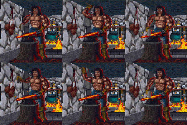
Although it has a lower quality due to it being from Arena, I just think this scene is purely badass. A buff, topless blacksmith working on a sword which has no doubt just been pulled from the fire. The fires themselves burning away in the background, and their heat no doubt being the reason why the smith is topless. The shade on his face is also very subtle and effective. This gif tells the story of a hard working, dedicated man, trying to make a living.
- Oppose: There's no composition involved here. While the gif animation is technically impressive, it might as well be taken straight from the game assets. In fact, I've never seen Arena animations run that smoothly in-game, so it doesn't seem like a particularly accurate representation either. I can't see any reason to support aside from the novelty of featuring an Arena image. —Legoless (talk) 12:32, 5 November 2015 (UTC)
- Support: I think the gif animation is awesome. DRAGON GUARD(TALK) 16:27, 8 November 2015 (UTC)
- Oppose: If looking at the background, it becomes evident that the image is too fast. Besides, I find that glow in his eyes when he hits the iron irritating. -- SarthesArai Talk 17:16, 8 November 2015 (UTC)
File:ON-creature-Guar.jpg
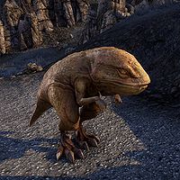
High quality and great lighting. The guar is an iconic TES creature and this image really brings ESO's take on it to life.
- Support: As nominator. —Legoless (talk) 16:08, 18 October 2015 (UTC)
- Support: Nice clear shot, and great lighting. ~ Alarra (talk) 01:16, 19 October 2015 (UTC)
- Oppose: The shadows/shade in the image is too awkward and distracting. --Rezalon (talk) 01:18, 19 October 2015 (UTC)
- Support: Who's a cutie beauty little guar muffin? You're a cutie beauty little guar muffin! Contrary to Rezalon, I like the way the sun shines on the guar and casts shadows; it makes the image look more "3D", bringing him out from the background. Weroj (talk) 18:22, 20 October 2015 (UTC)
- Support: I like the depth, the lighting, and the guar itself. Can't find anything bad here. --Vordur Steel-Hammer (TINV1K) 02:07, 21 October 2015 (UTC)
- Support: That little thing is adorable and I believe it's thanks to the clear resolution and a good angle. •WoahBro►talk 14:35, 5 November 2015 (UTC)
File:OB-quest-Paranoia_07.jpg
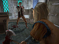
This image just gives of a lot of feelings for me. Suspense, tension, it's very cinematic, it has good lighting and shading. Overall, I just think it's a beautiful shot.
- Support: As nominator. --Rezalon (talk) 04:10, 14 October 2015 (UTC)
- Support: I do like their poses - this picture tells a story. Plus, Glarthir is a badass. Weroj (talk) 13:09, 14 October 2015 (UTC)
- Support: Just fantastic framing, and with a great eye for lighting. -- Hargrimm(T) 13:19, 14 October 2015 (UTC)
- Support: Ditto. -damon talk ♥ contribs 23:24, 14 October 2015 (UTC)
- Support: Naturally. It is on my user page after all! Forfeit (talk) 02:16, 15 October 2015 (UTC)
- Support: Photos like this are very smart. It gives you enough details, but still lets you ask questions. Whose blood is that? Is the person frightened of the man with the axe? Or was it from the person whose blood is scattered across the room? A proper mystery. FireAcolyte (talk) 07:05, 15 October 2015 (UTC)
- Support: So this is what happens if you don't just let the Guards/Surilie brothers kill him.... Schiffy(Talk) 16:04, 15 October 2015 (UTC)
- Support: Good angle, and nice action shot. ~ Alarra(talk) 23:35, 15 October 2015 (UTC)
- Support: The scene has been captured at a great moment. --Vordur Steel-Hammer (TINV1K) 02:07, 21 October 2015 (UTC)
File:ON-creature-Nereid.jpg
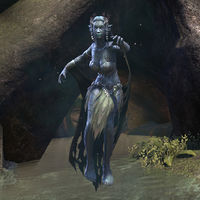
Of all the screenshots I've taken, I think it might be the one I'm most proud of so far. I managed to get a clear shot before she aggro'd me, nice and close, without the water effects obscuring her, and it's a pretty good pose too. I also like the balance of light and dark: the nereid herself is light against the dark rock, and the light-colored water allows you to see the dark cape as well.
- Support: That's a fairly interesting pose and creature, with some nice lighting to boot. --AKB Talk Cont Mail 06:55, 20 September 2015 (UTC)
- Oppose: While it's a good shot, I think it lacks anything special to make it worth featuring. Weroj (talk) 13:09, 14 October 2015 (UTC)
- Support: Given the inherent difficulty of getting a shot of any enemy in ESO, it's amazing how well this one turned out in terms of composition, clarity, and pose. -- Hargrimm(T) 13:19, 14 October 2015 (UTC)
- Comment: Thank you for pointing this out. That's one thing I forgot to mention about this too: for those who do not play ESO, images are a lot more difficult to take: you cannot control the weather or time, and enemy images are difficult to take because not only are you unable to pause things, but there are also UI elements that cannot be removed: enemies get a red aura when noticing you, and once they attack there are effects across the screen for several seconds whenever they hit you. I have one image on the wiki that took somewhere between 200 and 300 attempts before it even met our standards of good lighting, fitting on the screen, and no UI elements. To get this one that not only fits the wiki standards but also has such a good pose in the perfect location, I was extremely lucky. ~ Alarra (talk) 06:39, 15 October 2015 (UTC)
- Oppose: Per Weroj's opinion. DRAGON GUARD(TALK) 17:42, 14 October 2015 (UTC)
- Oppose: While I appreciate the difficulties that one would experience in gathering images in a game where you can't force the whole world to freeze and fiddle with things to your liking, I must side with the others in opposing it. -damon talk ♥ contribs 23:24, 14 October 2015 (UTC)
- Support: Ditto to Hargrimm and Alarra's comment below him. --Rezalon (talk) 06:41, 15 October 2015 (UTC)
- Support: A well-timed shot, with a pose fit for a statue. Not an easy shot to recreate. FireAcolyte (talk) 06:50, 15 October 2015 (UTC)
- Support: Good enough for me ~ Dwarfmp (talk) 10:54, 15 October 2015 (UTC)
| Prev: Archive 6 | Up: Featured Images/Past Nominations | Next: Archive 8 |
